2022 Design Trends

If you’re anything like me, you’re looking at your calendar and feeling a sense of excitement (nervous panic) at the movement of numbers and stars that is the new year.

Regardless of your stance on goals, resolutions or Ouija boards, there’s an undeniable force of energy that accompanies the new year. 2022 is no different and in fact, thanks to our current world happenings (looking at you Omicron 😒), that feeling has only further increased from 2021.

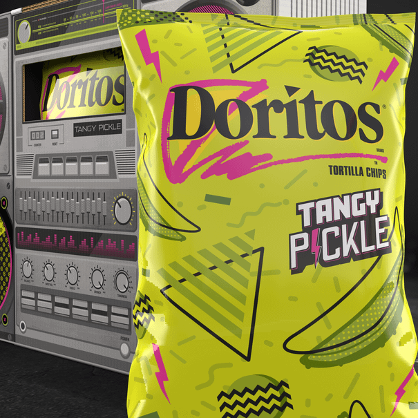
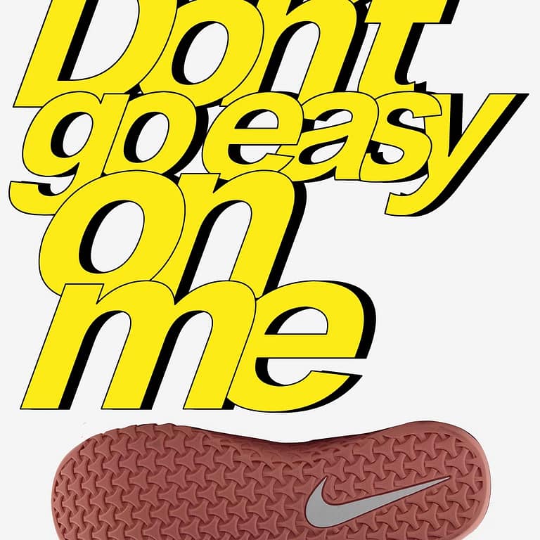
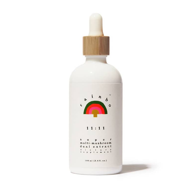
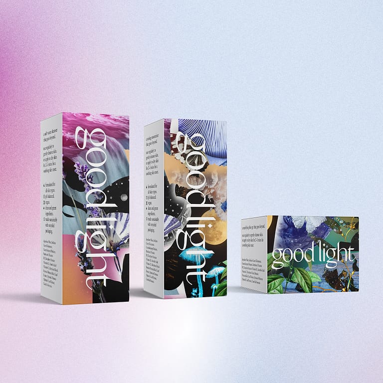
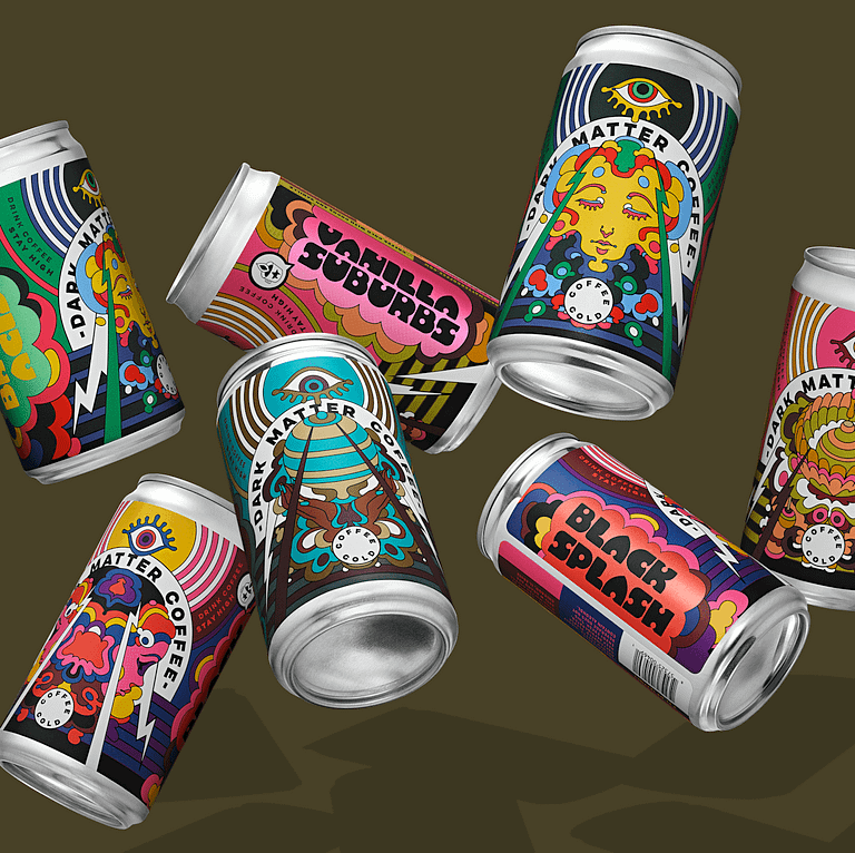
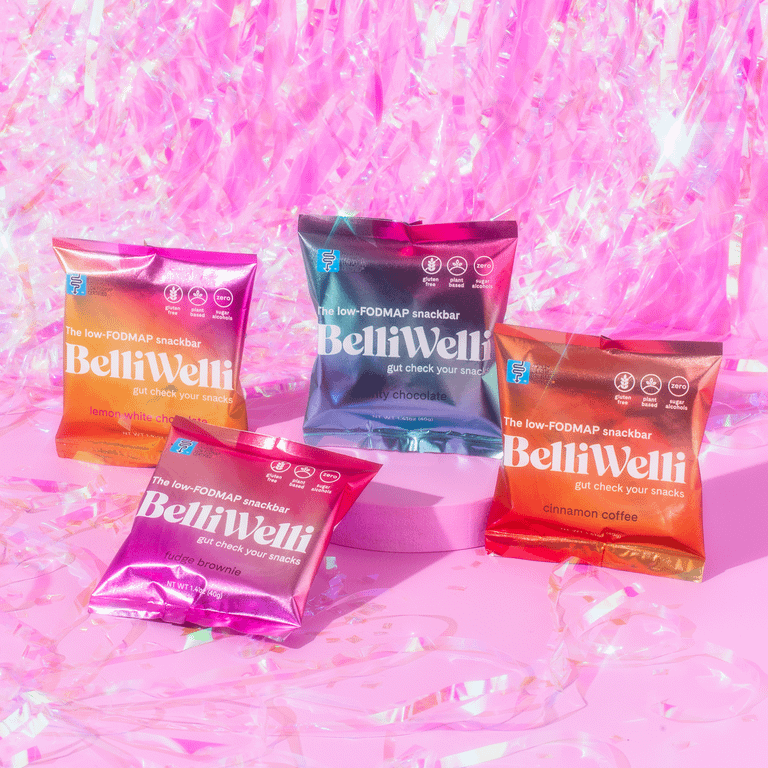
Of course, this re-formatting of energy doesn’t only occur in our minds but also takes shape in the physical realm. See Design.

The following is a culmination of research from various sources that I feel accurately forecasts the Design Trends of 2022. I’ve also added my own thoughts where I see opportunities for divergence. Read below to discover the wild (and colourful) days ahead.

Logos
The logos of 2022 are looking to continue in a similar trajectory as the past few years. A lot of people see “Flanding” (Flat Branding), as the promised land of logo design – discarding flourishes and excess for a lighter, more minimal (sometimes geometric) approach. As much as designers would like to lay claim to this trend, it’s been more a path laid by technology and our deeper integration with the digital world.

Logos for the internet demand flexible icons and wordmarks that can effortlessly scale up to a Times Square billboard or down to the tiny porthole of a Twitter avatar. Goodbye gradients and computer graphic effects, continue on with simplified and minimal. Just like the internet, Flanding of logos may be here to stay.

Colours & Textures
A unique feature of art and design is that it can either mirror its surroundings or diverge and take us away to a place in complete contrast to our physical realm. This contrast is set to happen with brands and personalities looking to not only distance themselves from large corporate entities and their perceived blandness but also as a way to offer their audience a retreat or escape from the past two years of Middleness we’ve collectively experienced.

Brands looking to transport their audience will lean to bright and vivid colours. This will most likely be paired along with specific eras such as a revival of the 90s. The 1990’s colours are tied to a special, more carefree and enjoyable realm for millennials (think Dunkaroos and Ring Pops) but also allows Gen Z a chance to interact with the forgotten decade.

Psych
The mainstream acceptance and exploration of psychedelics set to come over the next few years will bring a renewed interest in graphic elements that align with this realm. There will be abundant opportunities for designers to implement “trip elements” in their designs with no attached stigma or even direct connection to suggested substances. Blurry mesh gradients, Retro-Esque colourways, kaleidoscope-like imagery and photographic collages (like you would have made with old Nat Geos) will all make their way into the updated versions of the previous psychedelic era – an “escape” to trippers and non-trippers alike.

Unicorn
Another realm of retreat from our current world will continue in the form of “The Unicorn Glow.” Think dreamy and magical elements such as mirrored-pastel, diffused gradients and holographic print effects. This trend has much room to grow with the pandemic leaving us feeling stagnant and in need of magic.

Fonts
With the revival of the 90s will also come elements of the 60s and 70s. With these 1970s inspired graphics, more fonts will lean towards “soft-served serifs” (or serifs with softened edges) to evoke a feeling of approachability and friendliness. These may be directly connected to psychedelic brands or communicate a message completely separate.

Rebel
Of course, the above are trends that will come from the majority. Niche pockets will differ drastically as an unapologetic reaction to the mass – Rebel Design. Variable fonts (VAR) will make their way into designs where flexibility is allowed while remaining legible. These could also see a Brutalist treatment working directly against minimalism. Eclectic, angular, sharp and ALLCAPS lettering will be featured for temporary logos, one-off events, luxury/boutique fashion or fringe apparel in contrast to the extremely geometric and often non-descript feels of Flanding.

David Carson’s rule-breaking imagery will re-emerge as a way to once again break away from the grid layout. These elements will be designed with an air of laissez-faire or a Bondi surfer’s “no worries” while adding their own 2022 edginess to the mix. Colour blocks will be used in either bright non-complementary colourways or on dark/black backgrounds.

Collabs
And, of course, more promotional collabs…

The Future
As 2022 brings in fresh design trends, colours and fonts, digital mediums will also grow further and faster thanks to last year’s adoption of Web 3.0, NFT’s, Tokenization, Blockchains and Augmented Reality. This will inevitably lead designers to combine old trends with new solutions to fit their new medium of communication.

Although trends are helpful for any designer, the confluence of the known and the unexplored is where NEW and INTERESTING truly happens. Let’s all aim to land in this beautiful intersection for 2022 and beyond 🚀

Looking for more news insight and happennings?

Showcase your Toronto pride with this 13″x17″ screen-printed poster featuring 44 iconic Toronto locations and happenings. Some are widely recognizable and others are just plain quirky.⁠