Behind the Brand: Manmi’s Pikliz

Peek inside any Haitian’s cupboard and you’ll find a jar of colourful spicy slaw ready to smack you straight in the taste buds. Toothsome as it may be, Pikliz flies mostly under the radar. This isn’t due to inferior flavour, but rather to its lack of connection with heat-seekers from a branding perspective.

Hence, our goal to develop a branding story behind the slaw and showcase what has evolved into “Manmi’s Pikliz.” To give you an inside look into our branding process, we’ve put together a mock product launch including food photography, branded illustrations, and a dedicated Instagram account and landing page.

Unbranded Pikliz

What is Pikliz?

Pikliz [Peek-Leese] is a traditional Haitian condiment best described as a spicy slaw. Its base consists of cabbage, carrots, and scotch bonnet peppers. This slaw is often served alongside classic dishes such as: rice and beans, plantains crisps, griot and side salads. It’s definitely not for the faint of spice!

Island Inspiration

Our Research Process

Research and development are the most important steps to developing a strong brand identity. Our immersion deep-dive had us sourcing inspo pics from Haiti and across the Caribbean. We drew influence from beach scenes, tropical flora and hand-painted signage. Our mood board landed on a retro, playful aesthetic after scouring packaging examples from the world of consumer goods.

Consider these Elements when Building a Brand:

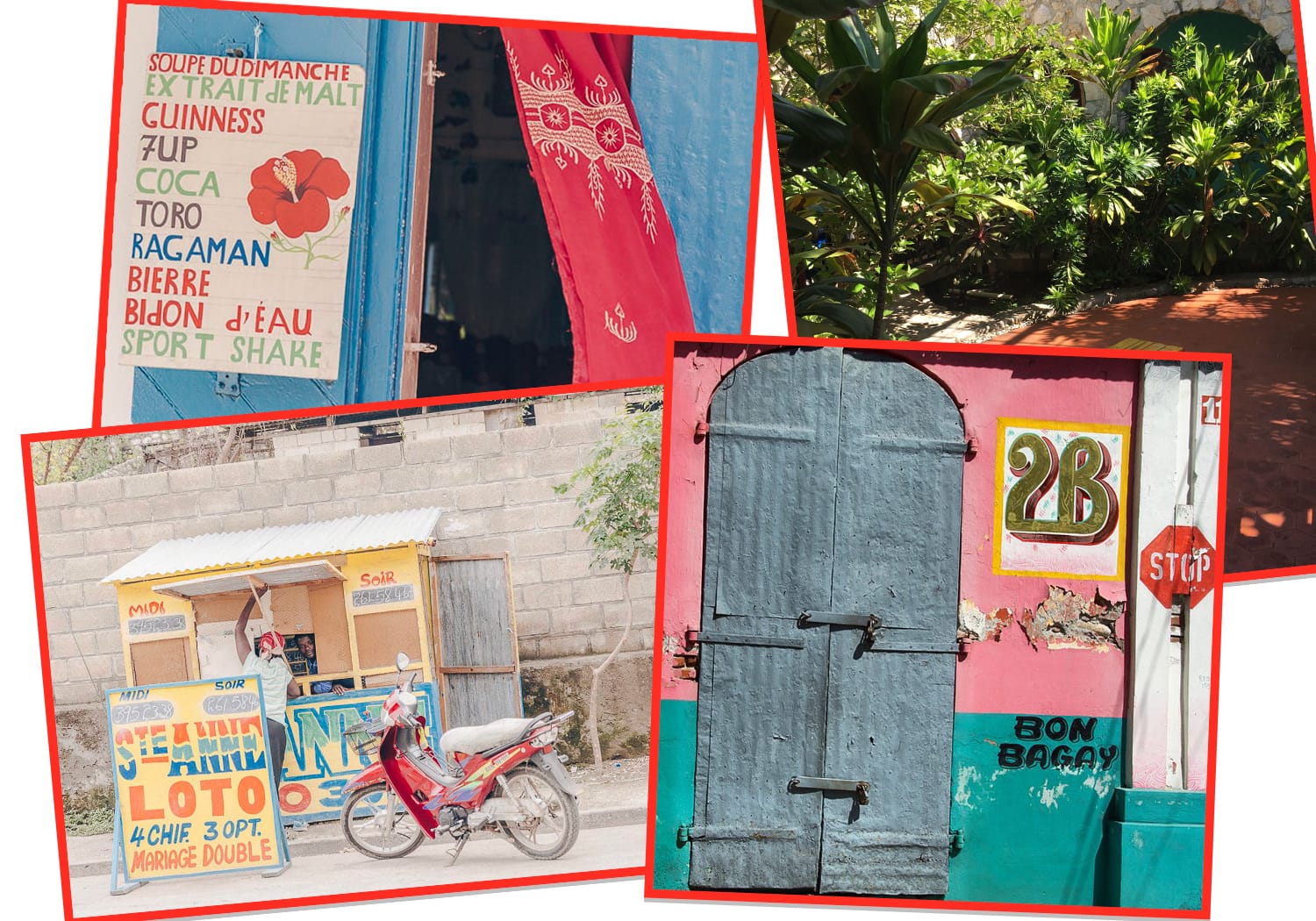
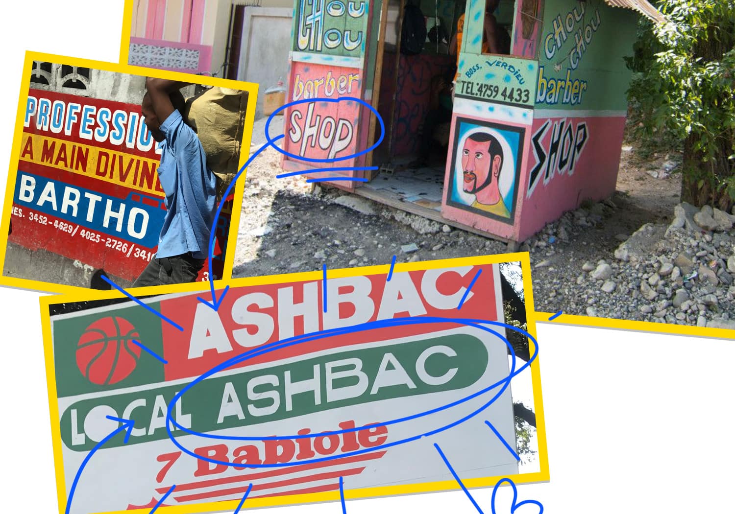
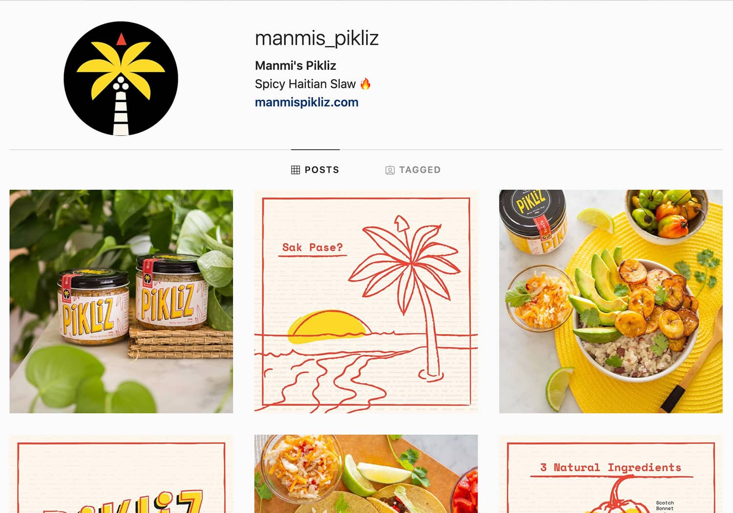
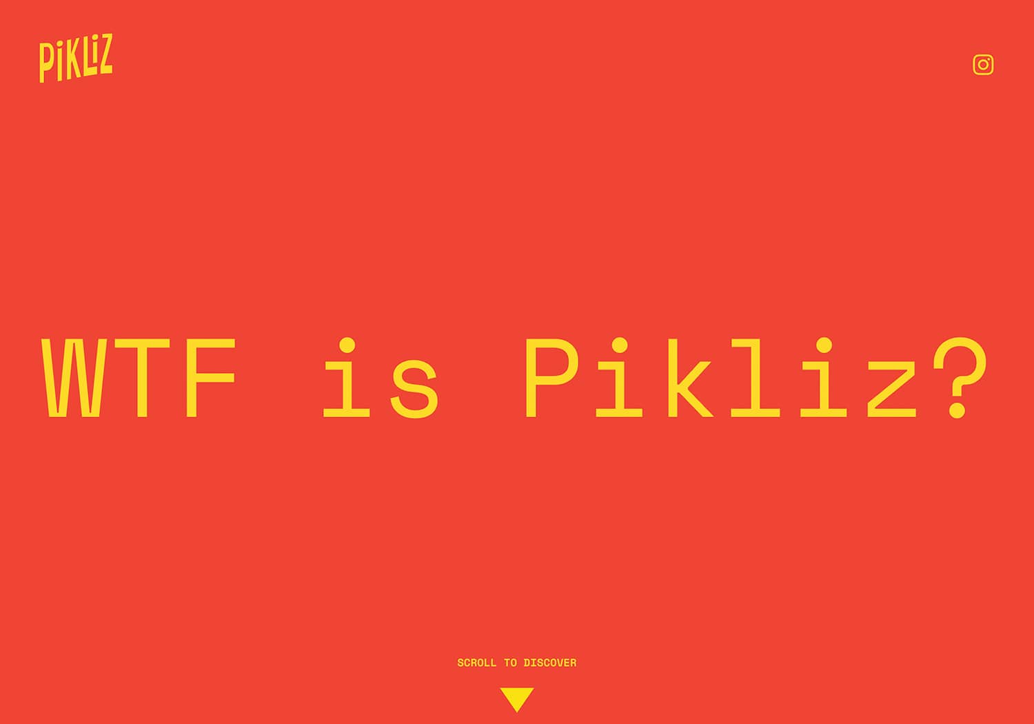
Brand Image – as a condiment, Pikliz is a fun experience for foodies. Our goal was to convey its funky feel with punchy assets and a cheeky brand voice.
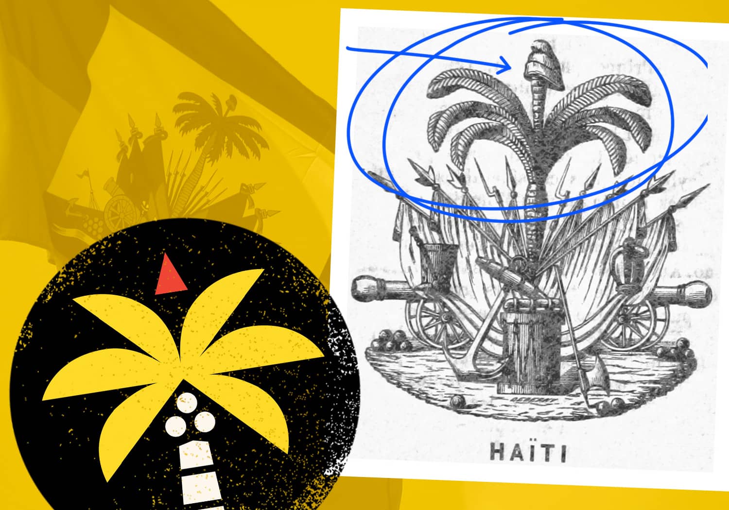
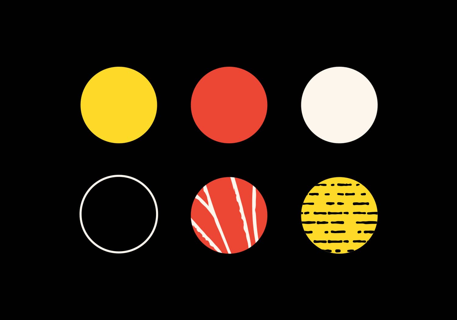
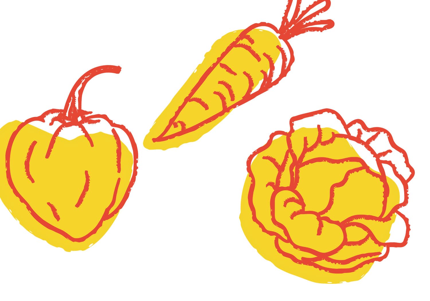
Colours Island-style retro with a hip diner vibe, we zeroed in on bright yellow, poppy red, and rustic crème for Pikliz’s brand colours.
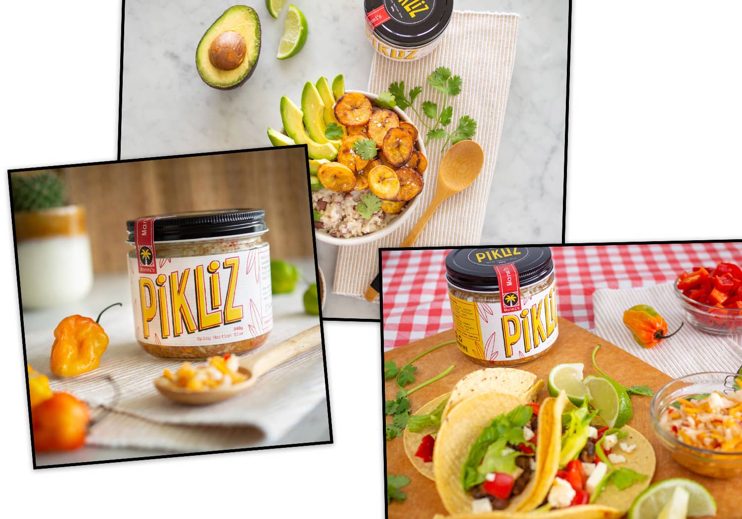
Positioning True, a Haitian grandmother can whip up a batch of homemade Pikliz on a Saturday afternoon. But with a mission to bring Pikliz to the heat-seeking masses, we sought to position Pikliz alongside the small-batch salsas you might find at your local health food store. Think: accessible, yet elevated.

Target market Calling all youthful, modern and city-based consumers! Pikliz’s target customer is a tableside traveller who likes exploring new cultures through cuisine. They’re not afraid of bold flavours and spicy food. Sampling new food products – with packaging worth showing off to dinner guests – is a regular affair. 
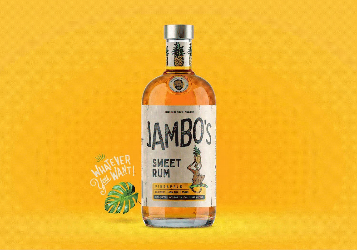
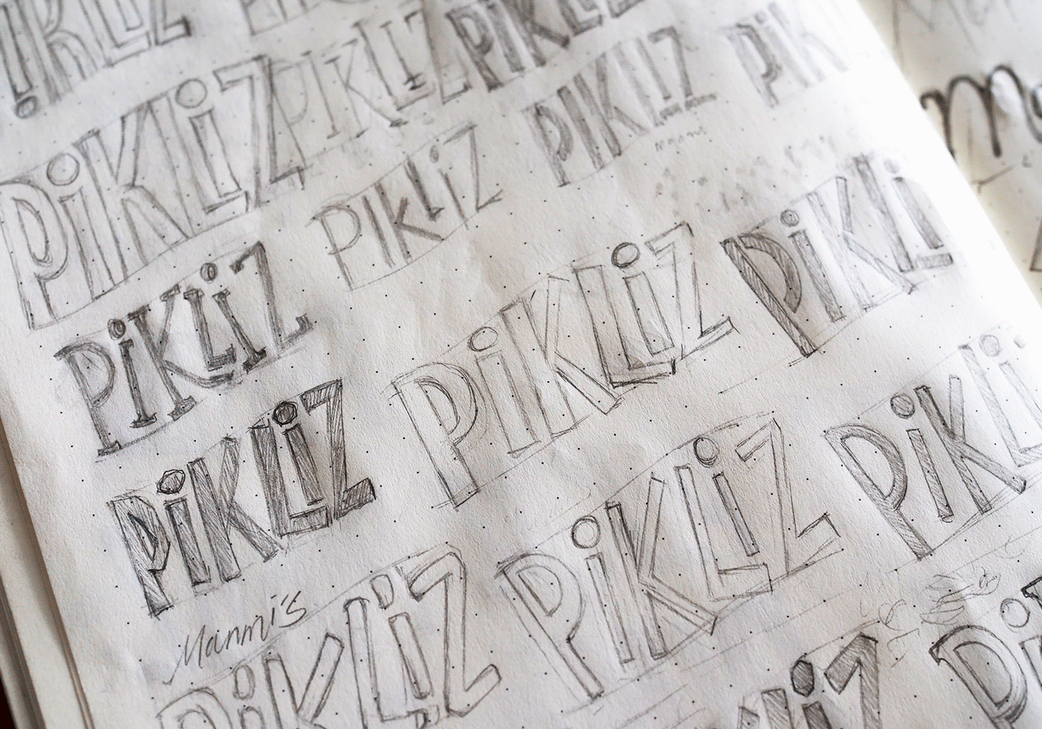
Naming In homage to its homemade roots, we selected Manmi’s Foods Inc. as the parent company of Pikliz. Manmi = mother in Haitian Creole. We imagined our Pikliz sitting alongside other Haitian food products that fall under the Manmi’s umbrella. To bolster accessibility, we added the explanatory tagline: Spicy Haitian Slaw, and the sassy brand hashtag: #SpicyAF.

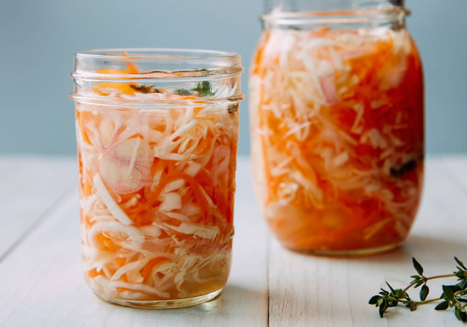
Packaging – We settled on a stout, salsa-style jar to allow for easy spoon serving, in a mid-range 340g size. The vessel is topped off by a black metal lid for that rustic look.

Lettering Inspo from Haiti

Custom Lettering

With a word as fun as Pikliz, we knew we wanted to showcase this front and centre. This meant a predominantly lettering-based package (vs illustrative).

A large part of our process was condensing a world of inspiration and historic icons. We looked to hundreds of hand-painted signage examples from the island of Haiti – our favourite versions striking the perfect balance between experimental and playful.

After drafting over 36 different lettering samples, we put our options on the chopping block and one design came out on top. In this custom reverse-contrast wordmark, each letter steps up, mimicking the light roll of coastal waves. A kick of vibrant yellow represents happiness and energy with an accent of red to tie in the spice factor.

Pikliz Lettering Development Process

Manmi's Logo

The Haitian flag has so much vibrant iconography, it was hard to select just one element of focus. Opting for simplicity and ease-of-recognition, we decided to develop the palm tree as Manmi’s brand logo. Atop the palm sits a red triangle/north arrow. This Easter egg is an interpretation of the Cap of Liberty – commemorating Haiti’s foundation by rebellious slaves. Pared down, the logo’s geometric rendering allows for ease of legibility at even the smallest of sizes. 

Logo Inspo from the Haitian Flag

Colours, Fonts and Illustrations

Developer-meets-geometric, the typewriter-esque Space Mono Regular was chosen as Pikliz’s main font. The titular Pikliz lettering is set against a rustic crème background with distressed horizontal lines. The black drop shadow adds to the natural movement of the text as it emerges from outlined jungle fronds, bold and bright.

The branding elements come together with a fun depiction of Pikliz’s star ingredient: the scotch bonnet pepper. We went with playful, outline-style illustrations with off-kilter splotch fills to compliment the fun-factor of the word Pikliz. The additional star ingredients, carrot and cabbage, were illustrated for the wider brand package.

Pikliz Colours
Pikliz Font
Pikliz Illustrations

Mock Launch on Instagram

A visit to @manmis_pikliz Instagram page demonstrates what a mock product launch would look like for this product. 

An important part of making Pikliz pleasing to the masses is education. Showcasing a variety of dishes that pair well with our slaw was paramount. To whet customers’ appetites for our spicy Haitian slaw, we photographed three dishes: blackened shrimp, black bean tacos and a plantain veggie bowl.

We bulked out Pikliz’s profile with illustrative posts featuring edutainment in Manmi’s signature sassy voice.

Edutainment Food Photography for Instagram

Pikliz Brand Landing Page

Head on over to our landing page for Manmi’s Pikliz to find out what all the hype is about!

Below the fold, three quick and quippy sections introduce you to the concept of Pikliz, who Manmi is, and the nutritional stats of our product. The Call to Action keeps visitors in the loop, and they can keep exploring by checking out our socials.

Pikliz Landing Page

Asterix Studio Expertise in Building Brands

They say that hunger is the best sauce. Fair enough, but we’d be willing to bet that Pikliz is a close second.

We love bringing brand stories to life! Dive deeper into the technical process behind this development by visiting our Case Study Page.

Looking for more news insight and happennings?

Showcase your Toronto pride with this 13″x17″ screen-printed poster featuring 44 iconic Toronto locations and happenings. Some are widely recognizable and others are just plain quirky.⁠